Sunday, 29 March 2015

Moodboards and themeboard for Claudia & Quentin project

Quentin's mood board

For Quentin's mood board, I have included my chosen keyword 'stitches' as it is my inspiration for the Quentin's look. I have also put the bruise, dark eye circles, tattoos and also the styling of costume and hairstyle that I'm going to use on my designs. The photo in the middle present Claudia lock Quentin in a room and the reason I put it in the middle of the mood board and also leave it in colour while the other photos are in black and white is because the images around is what Claudia imagine Quentin looks like in the room where he is locked. I have used a black background for the mood board as I want to create a horror and mysterious mood.

Claudia's mood board
For Claudia's mood board, I have included the hair, costume styling  and props I'm going to use for the shoot. I have put an evil clown make-up look as I want to create links to how Claudia likes to watch horror TV series. I have also included a half face clown makeup and half face natural make-up look because I want to present the two side of Claudia's character with two different make-up looks. It also create contrast as well and make the look more interesting and attractive. The picture where the girl is holding a mirror, I want to use mirror to reflect Claudia's make-up. I like the background that I've used in this mood board as it creates an uncanny atmosphere and the way it is cloud's pattern with dark greenish tones which I want to show that you won't expect what Claudia is thinking about the next moment and it creates a creepy mood as well.

Theme board

I have created a mood board for my chosen TV series 'Supernatural Season 7 episode 14'. I have included pictures from the episode, the fight scene of the protagonist Dean with the clowns where he overcome his worst childhood fears. I have put the 'supernatural' word from the trailer onto the mood board as it includes the colours red, green, blue and black are the colours which represents danger in the episode. And so for the background, I have used the colours to link in the episode. 

Blackletter

Blackletter is also known as Gothic minuscule or Gothic script. It was a script used in Western Europe from arounf 1150 to 17th century and was used in the Gothenburg Bible which is one of the first books printed in Europe. The style of Blackletter features dramatic thin and bold thick strokes and some of the letters has got swirls as well. The Blackletter also features condensed lettering and tight spacing which helps to reduce the amount of printings and money for book production. The Blackletter developed firther during mid twelfth century and more different styles of Blackletters appeared such as Textura, Rotunda, Schwabacher and Fraktur. 

Robert Bringhurst :  "Blackletter is the typographic counterpoint to the Gothic style in architecture."
http://dab1nmslvvntp.cloudfront.net/wp-content/uploads/2009/11/BlackletterChart.png
From Type and National Identity by Peter Bain and Paul Shaw.

"Blackletter type is often misleadingly referred to as either Old English or gothic, two terms that are only partially accurate. Blackletter is an all encompassing term used to describe the scripts of the Middle Ages in which the darkness of the characters overpowers the whiteness of the page.

The basic blackletter scripts are textura and rotunda, the former primarily asscoiated with northern Europe and the latter with southern Europe. These are both book scripts.

Bastarda, a third category of blackletter origionallly confined to documents, was elevated to formal status in the 15th century French and Burgundian book of hours... Rotunda types soon followed, cut by printers in Switzerland, and more importantly in Italy.

After 1480 schwabacher types, based on local bastarda traditions, appeared in Bohemia, Switzerland and the German status.

Fraktur, another bastarda-influenced type style, developed from Imperial Chancery hands during the reign of Maximilian I. Its name is derived from the broken curves that distinguish many letters."

Website references:
- http://www.designhistory.org/Handwriting_pages/Blackletter.html
- http://www.sitepoint.com/the-blackletter-typeface-a-long-and-colored-history/

Claudia's four make-up designs

Claudia's make-up design 1
For the first design for Claudia, I have mainly focus on choosing bright colours on this design. I have used the colour red on the cheeks. On the left eye, I have used a yellow eye shadow while on the right, I have used a light green eye shadow. The reason I use two different colours is because I want to create colour contrast and present the ideas of the funny character of  a clown. The under eyes make-up also create a contrast with the lips make-up as the patterns on the eyes look like the clown is crying but on the other hand, the lips show a smiling facial expression which symbolise Claudia has psychotic and also her mood always change as well. The cut on her neck adds horror effect to Claudia's character and I want to show the audience that she loves watching horror TV series. On this design, I am going to block the texture of the eyebrows with glue first, paint them in white and draw the eyebrows with black colour on the forehead as I want to change the brow shape and make the look more creepy. The face and the neck will be in white colour and I have used black eye shadow for shading.
Claudia's make-up design 2
For Claudia's design 2, I have used a cut next to the mouth on the right side to create a scary, horror look, like making the smile look more obvious. On this design, I have focus using the colour green yellow, red, white and black. The face and the neck will be in white colour. For the eye brows, I will use glue to block the texture of the eyebrows first, then I will paint them in white as well and draw a new brow shape on the forehead. I like this design because of how the patterns of the brows look unique and the way I blend the black lines of the brows patterns and the crease with black eye shadow at the bottom to create a three dimensional effect. This design idea of this make-up comes from shapes and lines. I have used triangles on the cheeks and circle on the nose on this make-up design. I like the way I have used green arrow under the eyes which I think makes the design more interesting. This make-up look is inspired by Peter Phillips's works which I've researched previously. 
Claudia's make-up design 3
For design 3, I have decided to present Claudia's character by dividing her face into two side which means the two side I will be doing two different make-up and I want to create contrast within the make-up. So on the left side, I will do a evil clown make-up which shows the audience that Claudia likes to watch horror TV series and she likes doing evil looking make-up on herself. On the right side, I have done a natural make-up look as I want the design to show the audience what Claudia originally is and the way she uses the clown make-up as a mask to hide her inner feelings and the clown character is used to fulfill her childhood and makes her feel happier I like how the lips on the clown side looks like she is smiling which gives an evil and uncanny looking. For the clown make-up side, I will block the texture of the eyebrows with glue first and then paint half of the face with white. For the natural make-up side, I will use a foundation colour which matches my model's skin. I like how I have blend the black colours under the brows pattern and under the lips and also on the lips, I have applied white colour to create shine and all these helps to create three dimensional effects. I have used black eye shadow to separate the two side of the face so to make-up the contrast of the make-up stand out more. The reason I use purple and black around the eyes because they are dark hues colours which links to horror and create mysterious effect.
Claudia's make-up design 4
For the forth design, I have also separated the face into two side and two two different make-up. On the right is the natural make-up while on the left is a clown's make-up. For the natural make-up side, I will use the foundation colour which matches my model's skin while on the clown side, I will be doing the face and neck in white colour. I will block the texture of the eye brows with glue first and then use the white base to cover it. For the lips on the clown side, I have drawn the angles higher as I want the look to show evil looking and creepy smile. On the clown make-up side, I have used a red eye shadow on the lid while on the lower lash lone and eye bag, I have applied a green eye shadow which matches the colour of the three patterns on the upper eyelid. The idea why I use green and red colour is because from the trailer of the series that I've chosen for this project, the colour green and red are included in it to show the audience that they are the colours represent danger in the series. I have used black gel liners to draw around the crease, the half triangle on the nose, under  and around the lips, cheeks and also on the eyes. I have used black eye shadow to draw a line in the middle of the face so the make-up will look more dramatic and stand out. 

Claudia's four hair designs

Claudia's hair design 1
For my hair design 1 for Claudia, I have decided to crimp the hair and remain the patterns. I will not brush out the patterns after crimping the hair and to achieve this, I will use a wide tooth comb and carefully brush and make sure there are no gaps between the hair. Middle parting is used on this hairstyle. For the props, I have decided to use a black hat.
Claudia's hair design 2
For Claudia's hair design 2, I will also crimp the hair, but this time, I will brush some of the patterns made by the hair crimper and to give the hair a bit texture. This will helps to create a fluffy, cute effects which is what a clown meant to look like. Middle parting is used in this hairstyle. I will also use a black hat on this design as well.
Claudia's hair design 3
For Claudia's hair design 3, I have decided to do center parting while the hair will tie into two ponytails. The two ponytails will position towards the face, so you can see them clearly at the front. The center parting and the top part of the hair will be sleek and flat while the hair from the ponytails, I will crimp them first and then brush them out to create big and frizzy hairstyle. I will use a bright red and a green colour hair bobble to tie the ponytails and these links to the series of Supernatural that I've chosen because red and green is two of the colours used to symbolize danger in that episode.
Claudia's hair design 4
For my last design for Claudia's hairstyle, I have decided to crimp all the hair first and brush them out afterwards. After that, I will use one green and one blue hair bobbles to tie the hair which links to the episode of Supernatural that I've chosen for this project as green and blue are two of the colours used to symbolize danger in that episode. For the low ponytail, I have used a blue hair bobble while for the other ponytail, I have used a green colour hair bobble and tie it high up. I have used a middle parting on this hairstyle. The reason I choose to tie the hair one up and one down is because I want to show the joyful and playful character of a clown's character and also symbolize Claudia's cheerful character which refer to the script.

Saturday, 28 March 2015

Quentin's four hair designs

Design 1
For Quentin's first hair design, I've decided to use a messy spiky hairstyle as when I design the hairstyle, I'm thinking as I've chosen the scene where Claudia punishes Quentin and so his hair might look a bit messy. 
Design 2
For design 2, I have used a classic quiff hairstyle because as the script described Quentin sometimes looks like David Beckham looking guy so I think he must be handsome and looking smart. The back of the hairstyle will look tidy.
Design 3
For hairstyle 3, I've decided to leave the fringe down and make the style look natural and simple. The back of the hairstyle will look tidy.
Design 4
For design 4, I've decided to do a side parting hairstyle which gives a smart and handsome style. The back of the hair will look tidy and straight.

Quentin's four make-up designs


Design 1

For the first design, I have created a dark black smokey eyes and the reason is that dark colours are always used in horror as many people afraid of the dark. It also means unknown and uncanny. I have used a dark brown colour shading under the cheekbones as I want to create a tired looking and this helps to make the structure of the face stand out more. The skin tone will be the same as the model so the foundation will match the skin tone of him. I have placed the stitches vertically and apply light colour blood on top to make it looks like its still bleeding and Claudia just done the stitches.


Design 2
For Quentin's makeup design 2, I have created a bruise on the forehead and it is purplish, red and bluish colour which is around 2 to 5 days old bruise. This helps to show Claudia punished Quentin more than once. I have used a dark brown colour to contour the face and dark eye circles as I want to make Quentin look tired and add a bit of horror effects to the character. I have placed the stitches in W patterns and add light colour blood to show the audience that the stitches are just done by Claudia which creates tension for the scene and also build an uncanny atmosphere which the audience will question why Claudia stitches Quentin's mouth?. The skin tone will be the same as the model so the foundation will match the skin tone of him.

Design 3
Quentin's makeup design 3, I have used dark brown colour to do the contouring under the cheekbones which make the structure of the face stand out. For the stitches, I have placed them in a W patterns and added light colour blood to show they are new stitches (fresh blood is light in colour). Also, for the cut on Quentin's neck, I will use cine wax to create the cut's shape first and then add wound filler and light colour blood on it. The reason I use a cut on the neck on this design because as Claudia likes to watch horror TV series, I want to create Quentin's character more scary looking. The skin tone will be the same as the model so the foundation will match the skin tone of him. For the eye makeup, I've used black smokey eyes because the colour black or dark colours in horror is associated with unknown and mystery.

Design 4
For design 4, I've created a bruise around the right eye. The colour of the bruise is purplish, red and bluish colour, so it means that it is not a new bruise and is around 2 to 5 days old which shows Claudia's having bad mood more than once and it is a way to tell the audience how Claudia express her emotions by punishing Quentin. I have added contouring under the cheekbones with a dark brown colour to make the structure of the face stand out more and it helps to create a tired looking. The skin tone will be the same as the model so the foundation will match the skin tone of him. For the stitches, I have placed them vertically and on top, I have added light colour blood which shows the stitches is new and whenever Claudia's having a bad mood, she will stitch his mouth so Quentin can't say anything.

Friday, 27 March 2015

Acne Paper Magazine - Circus Maximus

https://omfb.files.wordpress.com/2012/05/20120522-000706.jpg
https://s-media-cache-ak0.pinimg.com/236x/2a/b5/ce/2ab5ceac889ea39d11011d2a4eb75c41.jpg
http://www.musebeautyproblog.com/wp-content/uploads/2013/10/1383430_746558805370991_891822630_n-600x479.jpg
https://omfb.files.wordpress.com/2012/05/20120522-001018.jpg
https://omfb.files.wordpress.com/2012/05/20120522-000755.jpg
https://omfb.files.wordpress.com/2012/05/20120522-000857.jpg
https://omfb.files.wordpress.com/2012/05/20120522-000844.jpg
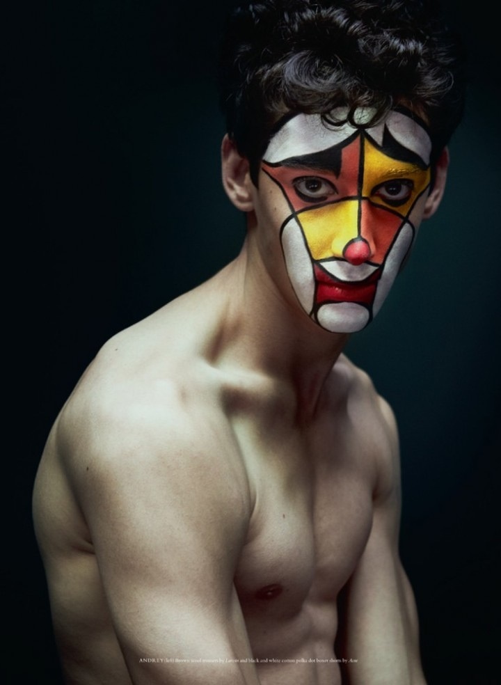
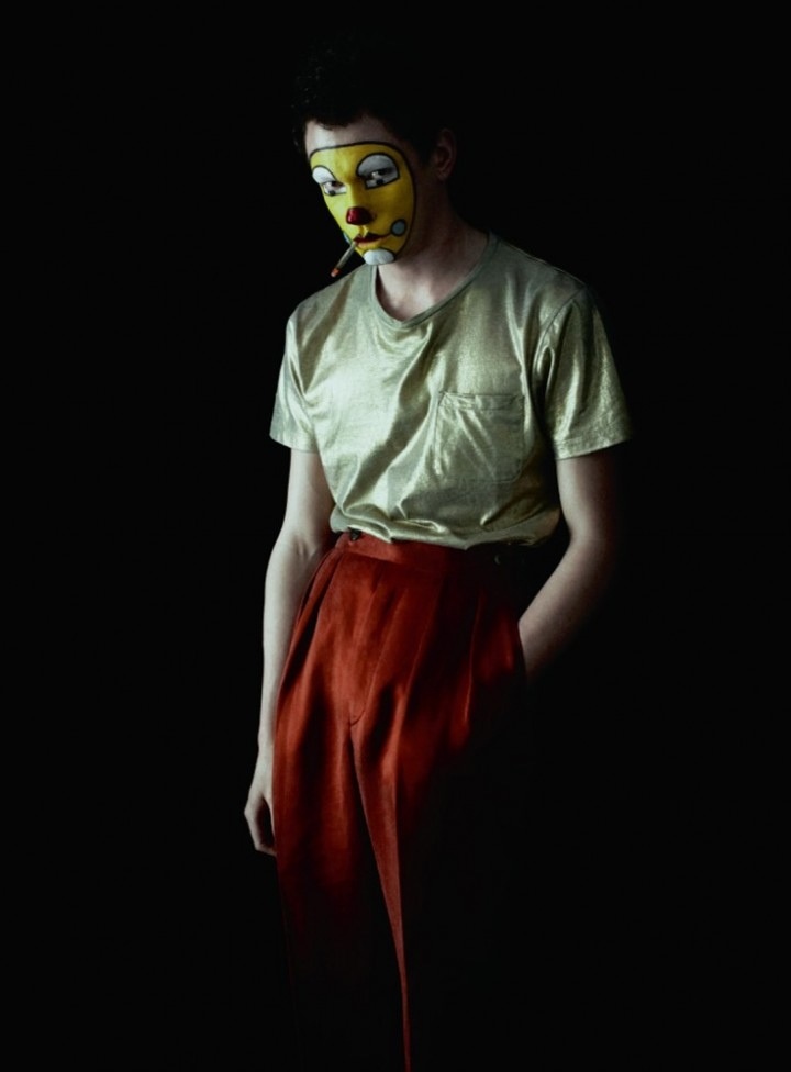
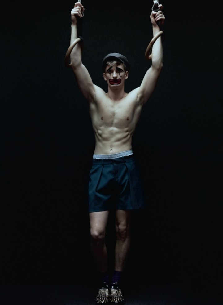
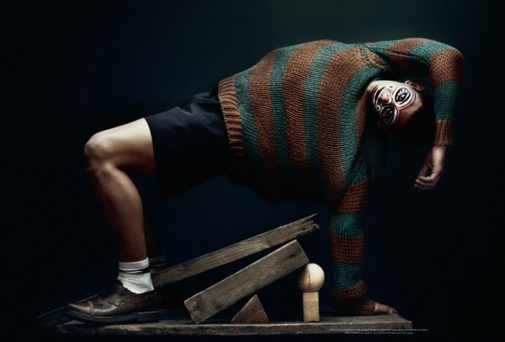
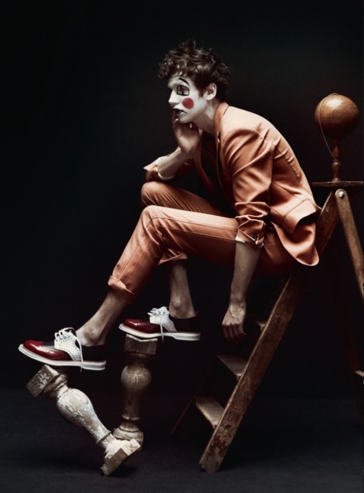
'Circus Maximus' is the title of the shoot for Acne Paper Magazine of Spring 2012 Body issue. The ideas of the shoot is about circus and clowns and I really like the way the models pose in the photos and how they present the photos in different body movements. Julia Hetta is the photographer of the shoot and the set design is done by David White. The Styling is done by Mattias Karlsson, make-up by Peter Phillips and hair by Joseph Pujalte. I like the fifth photo on above as I think the make-up shows horror effect and I like the lighting on this photo which creates a mysterious atmosphere. I also think the fifth photo a bit creepy as the body movements and the make-up gives an eerie and uncanny effect. I like this editorial shoot because I think it is creative to involve the ideas of clowns and circus in fashion photography. Through researching this editorial shoot, it allows me to understand more about clowns make-up and also the use of lighting to create different moods.